Sunday, July 17, 2016

"Summer Dreams," Authentique Photo Card

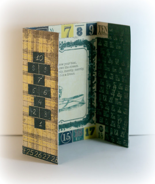
Here is another experimental project of mine.  I wanted to create a cut way to display school photos.  I used Authentique's, "Curiosity," line to create this card.  This is a bit simpler than the Graphic 45 photo card I made.  The only, "fussy," cutting is the two hop scotch boards.  This card can also be used as is, it looks like a finished product without the photo.


The Front.  I will say, I am not really happy with how my photos came out on this.  I will have to re-think my photo studio area.  Currently it's not a very good box since all of my boxes are covered in garage sale items.  However, that sale will be boxed up soon and I will be able to free up a box that will allow me to make a more professional photo studio area.  Hopefully after that I will be able to get some better photos.  You can see by the two different flap, "yellows," that my light is not blending well.  

Back to the actual project.  I do like how this looks, it's simple but attractive.  I really like the colors that Authentique used for this line.  I am much of a bright yellow type, the subtler yellow with the gray looks nice though.  

 The Inside: The paper pack came with a sheet of old childhood poems.  Some were a bit morbid, though they didn't include the, "ashes, ashes," on Ring Around the Rosies.  I created this to sale so I figured I should go for a nicer poem.  This kind of goes with the idea of a school photo card, though the kid is maybe dreaming about not being in school.  It's an older poem that has been around for a long time, so it would go well with a parent or grandparent school photo.  


Just some side photos.  The card is fairly rigid and stands well on it's own.  The only down side is that it's a little bulky.  It doesn't fold down very flat.  I am hoping more for something that will be displayed than stuffed in a drawer.  So, the flatness probably matters less with it's intended purpose.

I hope you enjoyed this little card.  If you have any comments or critiques please post them.  If you like this idea please feel free to make your own, I would love to see them if you want to share.


Thursday, July 14, 2016

Graphic 45 Photo Card

My crafting goal is to make mini albums that I can sale, at some point.  I have made two so far (which I will post when I have a chance to take some decent photos), one for me and one as a gift for a friend.  I am not a quick crafter, though, so I figured I would play with some photo cards and see how potential customers like them.  I enjoyed making this one, though with a two hour craft time I will have to sell them for a little if I want to make a simi decent wage.  Hopefully as I craft more my time will improve.
The Front.  I might make some in the future that will clasp shut, but I am going for something to go on someone's dresser for display, not in a drawer.  There is a Recollections 5x7" Gate card as the base  I measured and cut the orange background then added the border and images.  This photo is a tad too white, though when I was editing it earlier I thought it looked fine.  More areas for improvement.  I do kind of like how the paper gap on my little photo studio added to the photo with the white "frost" edge.  It was not intentional though.


You can see a little bit of the inside with this one and one little fussy cutting detail.  The, "I'm Really a Mermaid," square is only tacked down (scor tape) on the right side and the bottom.  The left corner is lose and you can use it to hold a photo.  The photo does end up being slightly off center in this one, since it's not especially wide, but it still looks pretty good.  I will have to make sure I take photos of the product in use the next time I make one of these.


Some better images of the sides.  These photos are slightly less whited out.  I took the top photo and the up-close fussy cut photo before at a different time than my three, "warmer," photos.  So, apologies for the inconsistencies.  If you look close enough, however, you can see that I didn't cut the sea plants that expanded beyond the squares.  I also edged the Seahorse picture with my Aqua Chameleon Pen.  

I had to add a little detail on the back.  I also added my little, "Made by Desdemona Rose," label on the back, but not until after I shot the photos.  The space was big and empty, so I had to do something with it.


Some fussy-cutting and a overly edited photo.  I also added a photo mat later, again after the photos.  But, if you decide to make anything like this and it has some size to it, I would recommend a photo mat.  I left mine as a simple piece of cardstock from the same paper set.  This way the customer will get both sides and can choose the one that looks better with their photo.  I am also including a strip of 4 temporary sticky dots so the customer can add the photo but change it later if they want.  

Please leave comments below and let me know what you think!

Voyage Beneath the Sea ATCs

I LOVE Graphic 45 for paper crafting.  Their images are the best for cutting things out and they are so detailed.  They also do a lot with Steampunk and some darker images.  Though they have plenty of flowers and pretties, they also have less pretty things which I appeal to me.  Though the world of paper crafts has given me new appreciation for flowers and pinks, I have never been much of a flowers and lace type.  I love companies that have a lot of variety while still keeping a sense of style.  Graphic 45 has that down.

I had to make some ATCs with their newer Voyage Beneath the Sea set.  The paper set is great, especially if you like Mermaids.  She is not in this art set, but they also have a fabulous image with a Octopus Lady, which I will have to put on something fantastic (not sure what yet).  You can see the entire set here: Graphic 45's Voyage Beneath The Sea

Without further ado:

Fish Man: not technically an ATC, but I loved this fish and needed to do something with him.  I glued him to some Silhouette chip board and fussy-cut him, chipboard and all.  I then cut out the Sea is Calling tag which came from the same paper as the fish man.  I used my Aqua Marine Chameleon Pen at full color to outline the words and make it stand out more.  The globe/button at the top of his head is from Tim Holtz and it was originally a little gear sticker brad.  I colored the sticker with a mx of Tim Holtz gold mixative and Lindy Stamp Gang's Magical tainted love teal pigment powder.  The paint is under the epoxy sticker that comes with his, "Custom brad," set.  I used the same mixture on the two gears and the brads that are holding them down.  I ended up going over the gears with multi medium matte since I was worried the alcohol ink wouldn't stick well.  When I did so it made the blue from the powdered pigment really pop out.  The gold wire is just simple jeweler's wire.  I put a few little dabs of mult medium matte mix and the gold/blue mix on the wire as well.  The wire is strung through the fish man's hands, though it does make it look as if he's holding it in a strange way.  I wanted something a bit more solid than the original paper though.  It is somewhat simple, but it took me an hour and 20 mins for the cutting, painting, wire, etc.  It was worth the time though.
_____________________________________________________________________________


Mermaid Travels ATC: This one is a traditional ATC.  I didn't do any fancy cutting with this one.  Originally I wanted the, "The Sea is Calling and I Must Go," phrase to show, but it didn't really work out well composition wise.  The three flowers are from Petaloo.  They are their original color, though they are made to be painted.  The embossed seahorse in the back is from Inkadoo.  I used Stampin up embossing powder which is fairly fine and nice for the more detailed images.  The teal hints on the background are from Faber-Castell's Metallic Mint Gelato.  I just smudged it around with my fingers after giving the edge some outline.  
________________________________________________________________________

I hope you enjoyed seeing these little guys.  If you like Graphic 45 as much as I do then stay tuned.  There will be plenty more in the future.


Bo Bunny Trail Mix ATCs


I decided to use up some (though not really much) of my Bo Bunny stash.  I have taken advantage of a few Bo Bunny Grab Bags which means I have some excess in some areas.  Their Trail Mix line being one in which I have a few duplicates.  So I decided to make a few ATCs that also double as magnets.  I am going to sell/display them at a garage sale I am starting tomorrow to see if anyone buys them.  If not, I still had fun making them.  Some details below.


Astoria ATC: Astoria is a old historical town next to the one I live in.  It is also the home of the Goonies house.  The scene where the kid Truffle Shuffles is kind of fun to watch now since I can easily recognize Astoria in the background.  This is a simple card and technically a bit larger than a ATC.  The Bo Bunny tag/paper is inside of a 3"x4" plastic card protector.  The Astoria is made with two Tim Holtz Fragments on some Bo Bunny scraps and letter stickers from the Trail Mix sticker sheet.  I have a container of ArtMinds Mosaic Glass from another project I never actually started, and there were some that were the perfect color for this, so I added them.  The fragments and mosaic pieces are all glued on top of the card protector.  The extra space did make the layout on this much easier.  Originally I was going to stick with a traditional ATC, but Astoria didn't really fit very well.
_________________________________________________________________________


Cabin Life ATC.  I am pretty happy with how the wood vellum piece ties in the Bo Bunny stickers and the dark brown cardstock.  The cardstock is just a generic dark brown piece from Michael's.  The wood vellum is actual thin wood and gives some nice texture.  I used Mocha Mama powderpuff from Quick Quotes to add a little more depth and outline to the binoculars ribbon paper and the Cabin Life sticker.  I fussy cut the ribbon out, which was not too difficult.  The lantern is a chipboard sticker from the same matching set. 
______________________________________________________________________


Fishing Life ATC: This one is somewhat simple.  The Fishing box and pole piece is a sticker and the world, "Fishing," is a separate one.  I used some green cardstock I had in my scraps and added some Tattered Angels Cardboard Baseboard spray to it.  There was a design, but the spray didn't really work well with my stencil.  It did add some nice little mystery blotches though.  Fishing is messy work, right?  The fish is a stamp from Inkadoo and I embossed it with Ranger Brick embossing powder.  I also stamped the fishing box sticker with a set of stamps I have from a unknown company (bought them used) that look like vintage post office stamps.  They didn't show up really strong, but I like how they are kind of hinted.  I was going for a slight post card feel with that.
_______________________________________________________________________


If you have any comments please feel free to post below!  If you make ATCs I would love to see them, post a link to your blog/site below and I will be happy to visit.

Tuesday, July 12, 2016

Amazing Little Cards

One of my favorite swaps on Scraps of Darkness/Elegance's Facebook is their Artist Trading Card swap.  ATC's are standard trading card size, in theory, at 2.5" x 3.5".  I have made a few ATCs at this point and they never stay neat and little.  Here are some of the ATCs I have created.  I love making them and if you would like one drop me a little Fiverr request.  I did start making some ATCs for a test sale at my garage sale this weekend.  If they don't sale then I will probably make an Epsy account and you can find already created ATCs there.  I do like custom making them to fit the receiver though.  I have tried to get more personal with them as I go.

In no particular order, here are some ATCs.


Once Upon a Story with Graphic 45.  I love fussy cutting and I really enjoyed making this one.  The wings on the butterfly have Reneaboquets Shattered Glass glitter.  It's a little hard to see in the picture, but the fairy wings have dots of brick colored embossing dots.  I loved how the wood grained scrapbook paper (I think it was from Michael's) adds to the rest of the ATC.  


Grandmother and Smiles.  I made these specifically for a crafter that I swapped with who was also a grandmother.  I wanted them to be somewhat matching, but also unique.  The papers were just scraps from my stash.  The Yellow flower came from a Quick Quotes kit that I took apart.  The black and gray flowers are from Michael's.  The butterflies are stickers that I added to cardstock and then cut out.  The black and white mini hearts were scraps from another project where I made a heart boarder.  I thought, "well, lets keep these, I cold put them on something."  I am very much a, "waste not," boarding on hoarder type crafter.  Sometimes it makes my craft room a pain to organize, other times it works out.


Graphic 45 Mime.  The original paper I got this from (Graphic 45) was all monochrome.  I wanted to play with my Chameleon Pens.  I colored all of the yellow and the red.  The little black flower was just something from my stash and the Admit One charm is from Tim Holtz.  I just used some jeweler's wire to make it a small necklace.  The little ticket is 7 Gypsies.  I was happy with how this came out and I hope to use my Chameleon Pens more in the future.  


This is a quick one I put together for a girl on a house cleaning and organization group I have tried to get going on Facebook.  I thought maybe a little incentive to get some participation.  The recipient put pictures of her kitchen in my group so I tried to match colors on a sign she had hanging up for decoration.  


Love and more Graphic 45.  I had some Valentines papers and was sending cards to a recipient who had recently gushed about how supportive her significant other was of her crafting.  So, I made her some grungy romance ATCs.  The butterfly and rose come from Michael's generic embellishments they sell in their discount area.  The background of the Love (only) card and the little clocks come from Tim Holtz.  


A peek-a-boo tree,  This one was experimental for me.  The tree is hand drawn on spray misted ATC canvas.  The tree was drawn with a Chameleon pen.  I did draw the tree in it's entirety before overlaying the simi-transparent paper.  You can see the tree behind the paper a little better in the actual piece.  I am still working on that art photography thing.  This probably would have worked better and more dramatically on a larger canvas.  Working with the wire in such a small setting was pretty challenging.  I am pretty happy with it, though I can't say it's a favorite of mine.  I will probably redo with more details on a larger canvas at some point.


My first ATC.  I really wanted to add some hand painted and slight surreal feel to it.  I added some bits from an ephemera pack I had bought and sent it along.  The recipient seemed pretty happy with it.  I want to add painted elements and more surrealism to ATCs in the future.  So, stay tuned.

Let me know what you thought.  Any input is always appreciated.  If you are a Fivver customer then please let me know if any of these styles suit you.  Also, stay tuned for more pages on ATCs.

Wednesday, July 6, 2016

First Pocket Letter


My First Pocket Letter

I created this as a swap for Scraps of Darkness/Scraps of Elegance's Facebook page.  It's a little bit of a "use up some scraps," type of, so I am not going to post a long supply list for this one.  Just wanted to show off some photos.  This is a mix of quite a few different brands.  Purple is Donna's favorite color so I went with that.  I wish I had more matchy purples, tone wise, but I am still pretty happy with it.  Hope you enjoy.


Create: I think this is my favorite ATC in this set.  I love that butterfly.  The clock is covered with spray mist and I added some gray powder chalk ink to the bottom.  The effect looks a little more colorful in real life.  At some point I will learn to take better photos.


Spread Your Wings: because this wouldn't be a project from me without some fussy cutting.  I accidentally cut the stamp behind the birds tail originally.  Thankfully I was able to carefully glue it in and make it look nice and complete.


Hello: I wanted this to read a little like a letter, so I started off with Hello.  I also made this ATC individually for a challenge at Renea Bouquets, which is where the butterfly came from.  If you like glitter then I highly recommend checking out her chunky glitter glass.  I don't even like glitter much, but find working with her chunk glitter glass fun.  It's a interesting way to add a unique touch to your projects and less messy.  She also makes embellishments, like the butterfly.


Inspire: A simple layout, but it was a little challenging since I wanted the wings to stick up.  I had to cut the plastic carefully, fold the wings, and squeeze them through.  I was pretty happy with the end result, though the photos I tried to take of the, "3D," effect came out kind of blurry. 


Pocket letters are a fun way to send crafts and greetings.  They are also a good way to use up scraps since each section is pretty small.  I have seen Pocket Letters where all of the squares have the same base paper and they look nice as well.  So, if you want a unique gift or want to swap some art this is a great way to do so.  

As always, critiques and comments always welcome!  If you want to know where any particular part of this came from let me know in the comments.  I am pretty sure I could direct you to most of the bits and pieces used.